

Until recently, font technology had been relatively stagnant since the 90s. A new joint venture created by Google, Apple, Adobe, and Microsoft, however, has produced an exciting development that will revolutionize web typography: variable fonts. Variable fonts are an OpenType font format offering typeface personalization in properties such as weight, width, slant, and optical size.
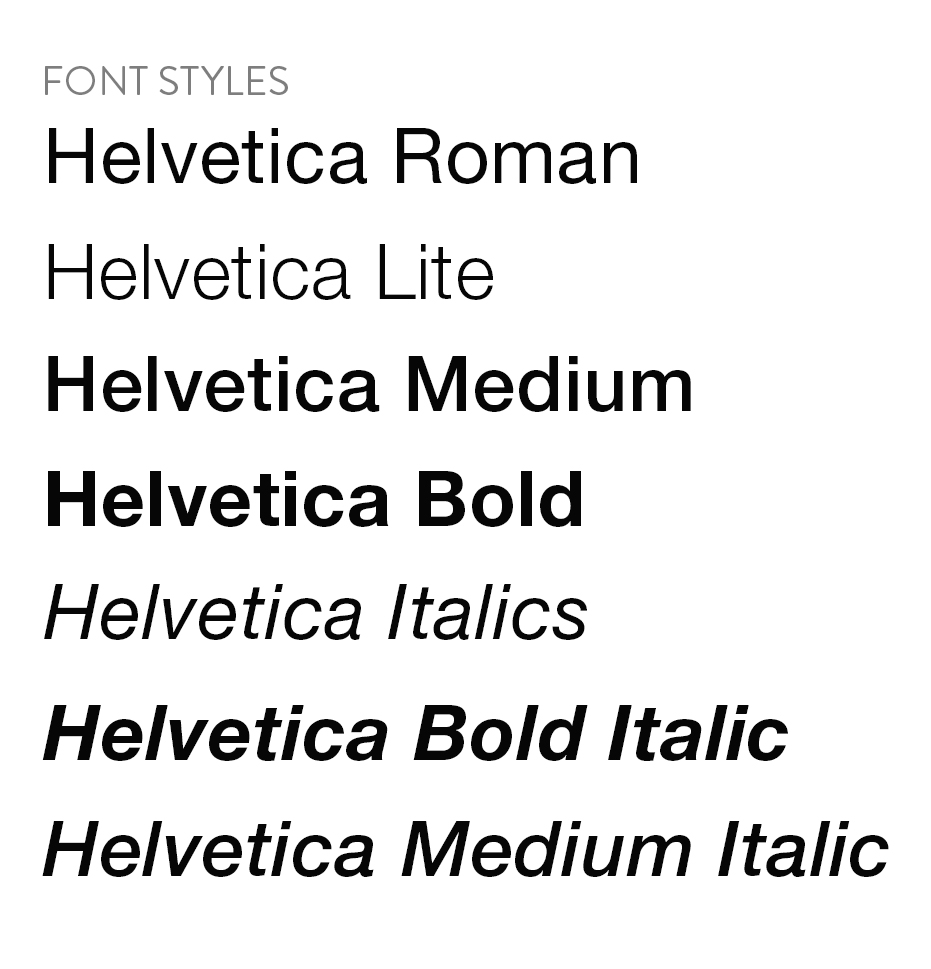
Currently, to express different font weights and styles, multiple font files need to be loaded onto the webpage. This adds weight to the website, causing issues like:
- Longer load times
- Higher carbon footprint (the bigger the file size, the more energy it takes to deliver to users)
- Fonts rendering differently on multiple browsers
- Fonts not set up for responsive design

With variable font technology, web designers will able to load a single font to express all the different styles it needs. Fonts can be tailored to accommodate a variety of viewports and naturally flow in responsive design.
Most newer browsers are compatible with Variable fonts but may not work with older browsers. While the technology is exciting, it will take time to have full cross-browser support.
As a UX designer at Silverchair, we prioritize not only user research, but industry trend research, so that we can continue to supply our clients with the most modern and efficient designs possible. We look forward to incorporating variable fonts into future work as the technology develops.
To learn more about variable fonts visit adobe.com